From share graphic to kinetic typography
Designing a short social clip for PRÜF
Most of my work so far has been procedural 3D in Houdini. This project is 2D – kinetic typography for a petition clip – and I enjoy that side of motion design too. Different tools, same way of working: a few strict rules, applied consistently, doing most of the work.
Originally published on Instagram.
How do you turn a dense political demand into a short social clip without simplifying it beyond recognition?
That was the central design problem behind this animation for PRÜF. The demand behind every PRÜF demonstration reads, in full:
Alle Parteien, die vom Verfassungsschutz als rechtsextreme Verdachtsfälle oder gesichert rechtsextrem eingestuft werden, sollen durch das Bundesverfassungsgericht überprüft werden.
It is a distinctly German sentence: precise, rich in compound nouns and perfectly happy to make the reader wait until its final words for the actual action. In English, the petition calls for parties classified by Germany's domestic intelligence services as either suspected or confirmed right-wing extremist to be reviewed by the Federal Constitutional Court.
The wording is exact, but it is also long. A share graphic – the still image an organisation posts and its supporters pass on – can show the complete sentence at once; a short film has to set the reading pace while keeping the meaning intact.
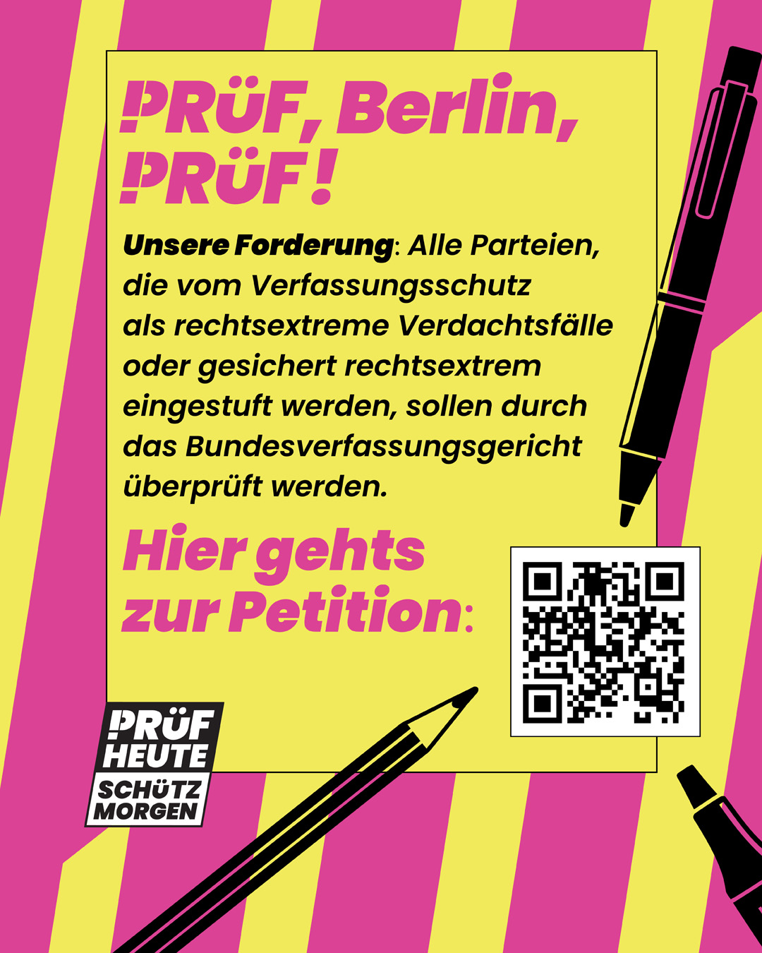
The film is based on an existing share graphic for the same demand:
Designing for the social-media interface

Every decision in the film had to fit one condition: the phone screen and the interface on top of it. Core text and logos stay inside a 950 × 1330 px working area within the 1080 × 1920 px frame – roughly three fifths of the picture. It sits above centre, because Instagram's Reel interface covers the lower edge with caption, buttons and profile name. This safe area determines the line breaks, type sizes and animation paths, especially for long German terms.
Above and below the working area, nothing essential could go anyway. So the stripes run free there, and the text sits on a yellow panel that spans the full width but stops at the safe area above and below. What started as a restriction became the stage for the text.
Translating the share graphic into motion
Instead of simply animating the share graphic's finished layout, with every element flying in to its original place, I assigned its elements specific functions. The stripes form a continuous background layer that never comes to rest: it is meant to convey a constant sense of unrest and time pressure throughout the film. Black type carries the argument on the yellow panel, which gives it a calm surface to be read on.
In the share graphic, the panel has a thin black outline on all four sides. The film keeps it only above and below, where it lifts the panel off the rotating stripes, as if it lay on top of them. At the sides, the panel runs to the edge of the frame without an outline, so each slide swipes in from nowhere on the right and disappears to the left. Only the last transition breaks this pattern: the call to action rises from below, as if the camera moved towards the viewer to address them directly.
The share graphic used magenta for text, because everything was visible at once and colour helped to sort it. In the film, the text arrives piece by piece, and each piece has to be read as quickly as possible – black on yellow does that best. Beyond the stripes, magenta appears in exactly one place: the underlines that mark the classifications.
The underline had to come from somewhere, and the share graphic supplied it. The line illustrations around the QR code – a marker pen, a pencil and a fountain pen – were there to draw the eye to the code.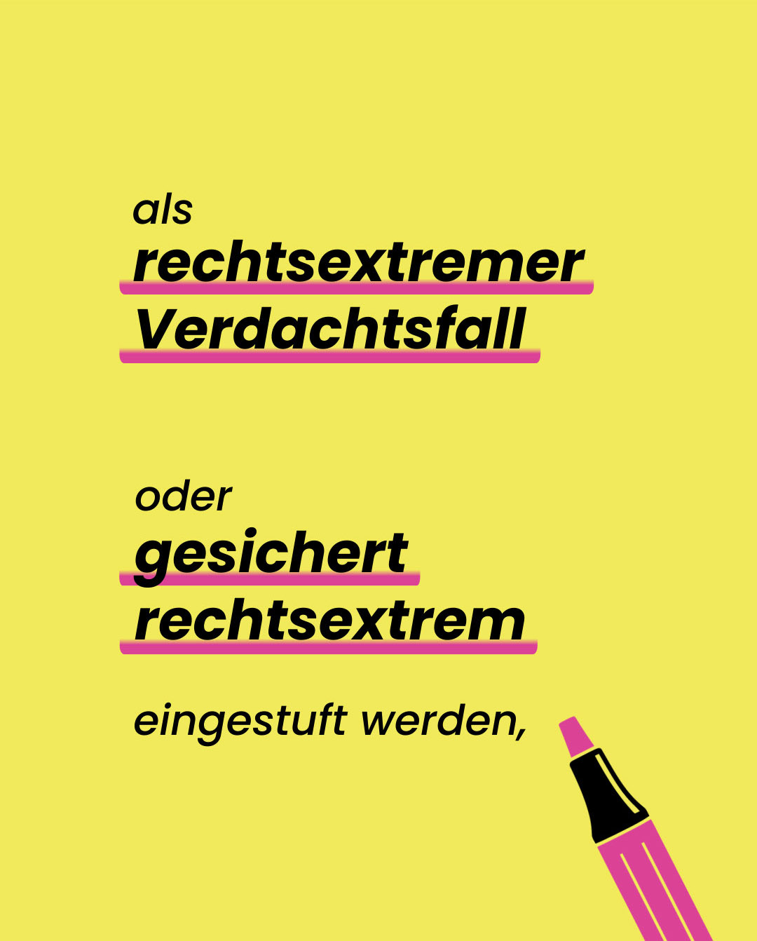 Final frame of the slide: both classifications in bold, each underlined in magenta, with a marker pen beside the lines. The film has no QR code – it is watched on phones, where a link in the caption is easier to reach than a code on the screen – so all three were out of a job. I kept the marker and gave it a new one: it draws the two underlines. Colouring its grip and its tip in the magenta of the line finished the change – what had been decoration became the hand doing the marking. Classification by the domestic intelligence services is precisely that: an authority marking a party in its records.
Both classifications get the same underline, deliberately: a suspected case may later be classified as confirmed right-wing extremist, but the petition treats either status as sufficient grounds for a review. The film shows them in order of severity, on different beats, and gives them identical weight.
The marker is not the only tool that does something. Alle Parteien – all parties – is accompanied by several stylised party symbols. When the demand reaches the review, the film narrows to a single one, and a magnifying glass moves in from the right, first enlarging it slightly, then closing in hard. Two objects, two actions: one marks, the other examines – which is the whole demand in two gestures.
Timing the text to the soundtrack
The soundtrack set the grid: 80 BPM in 4/4, one bar every three seconds, nine bars. Every element enters on a beat, none between them – even the background keeps time, with the stripes turning a short step further on every quarter note. Bars two to six build the sentence up piece by piece; bars seven and eight show it complete, before the ninth hands over to the call to action.
Long terms receive more time rather than simply being made smaller. Bundesverfassungsgericht and the action it performs run over two full bars – the word built up in three steps until it forms a single typographic block, large enough for a phone screen.
Bars seven and eight are what makes the long sentence work: a demand of this length has to be legible in one piece at least once, not only as a series of fragments. Six seconds of motionless type would stop the film, though, so the block only slides in and out – and exactly there the soundtrack begins to tick in sixteenths. A clock in the corner picks up the ticking. The sentence stands still; the time does not.
The finished clip turns a sentence built for reading into one built for watching.
Let’s talk
Have a campaign, an existing visual identity, or a message that has to survive being set in motion? I'd like to hear about it.
Discuss a motion project →Credits:
marker illustration designed by Magnific;
music “Dark Trailer” by ArctSound via Pixabay.